Standing out from the crowd, especially if you are a small business owner is hard. That means that you need to stay on top of the trends in web design even if you are not a designer yourself. Your potential customers visit tons of websites on a daily basis, so making them stay on yours is a tricky job.
The first step you should take is to create a visually appealing and intuitive website. In today’s environment that’s awash with information, your website needs to be intuitive, to communicate a strong message on a first glance.
Also, consider taking some web design courses (or make sure your designer does) as they also help to keep up with the most recent trends and skills polishing.
Let’s explore the web design trends for the upcoming year that will ensure your website is clear and uncluttered, yet still rich in information…and trendy.
Here is our choice of 20 trends in web design that will be noticeable in 2022:
- Dark mode
- 3D elements
- Oversize
- Whitespace
- Exposed grid
- Minimalist navigation
- A mixture of photography and graphics
- Tailor-made illustrations
- Luminous color schemes
- Bold fonts
- Split-screen content
- Overlapping layers
- Fullscreen forms
- Retro fonts
- Horizontal scrolling
- Augmented reality
- Custom cursors
- Monochrome with a pop of color
- Scrollytelling
- Physical products turn digital
…but, that’s not all! We’ve asked pure experts to share some insights on what would be the biggest trend in web design next year!
Trend #1 Dark Mode
Dark mode has been around for a while and the predictions are that it will still be present in 2022. The interesting thing is that this trend has a practical beginning. Big brands, such as Instagram, Android, and Apple offer an alternative dark mode as it is easy on the eyes. Today, many other apps and websites offer visitors the option to choose if they want to activate this ultra-modern, yet healthier mode.
Dark backgrounds are praised by designers as well. Why? – They allow other elements to pop-out. Besides, if you are using an OLED/AMOLED screen, the dark mode can significantly save your device’s battery power.
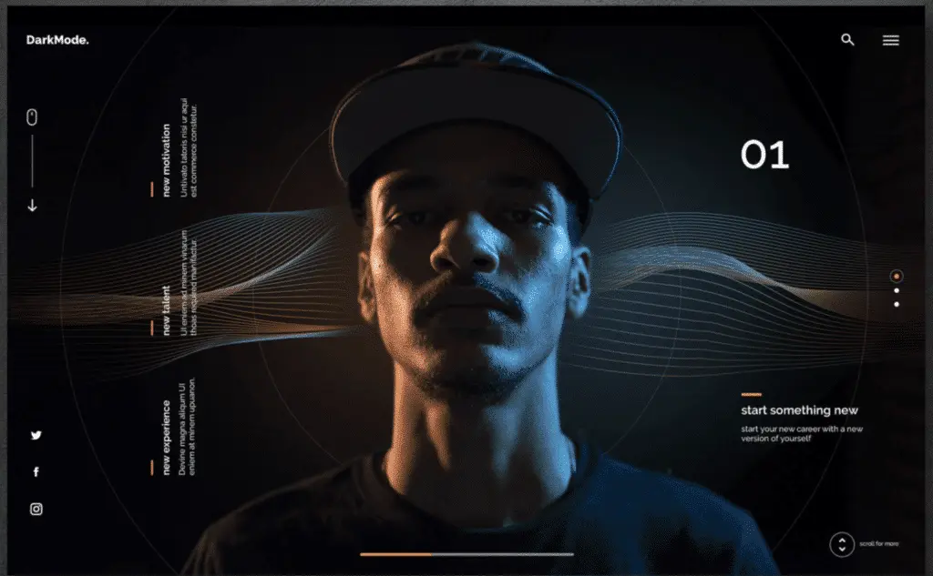
Is there any reason you haven’t still implemented dark mode to your site’s theme?
Trend #2 3D Elements
3D elements fascinated both users and designers for several years now. The reason why they haven’t been around that much is the costly technology behind them. Still, as VR technology is gaining momentum now, our forecasts are that the 3D trend is going to reach its peak in the next moths.
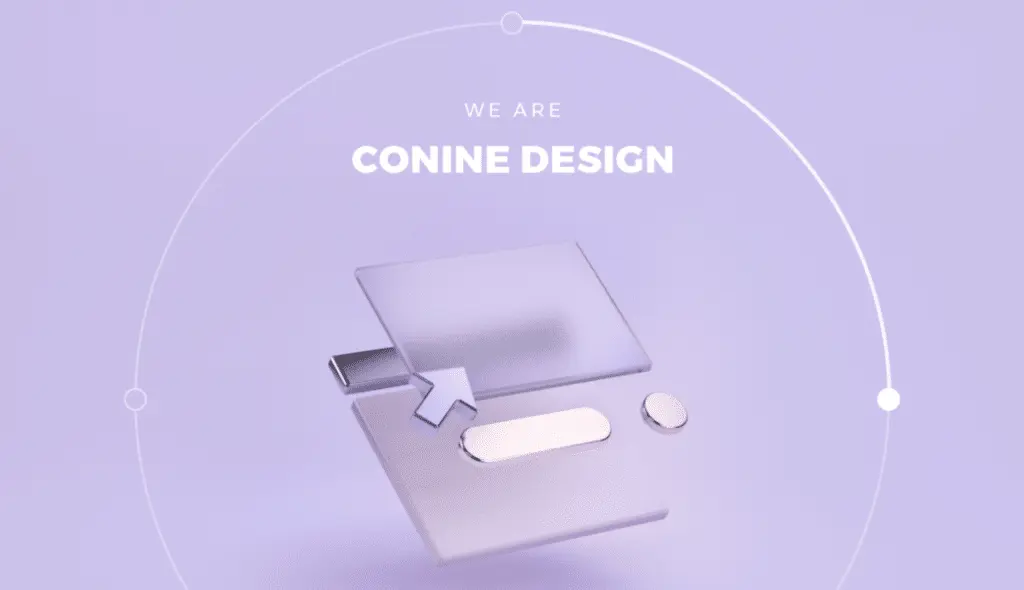
When the designers combine VR and 3D we’ll enjoy some hyper-realistic visuals on our screens! On top of all, users will tend to stay longer on the websites to explore other stunning 3D visuals which will increase the average session duration.
A small warning: one of the main requirements to implement 3D visuals is a high performing website. Make sure you double-check if everything is well optimized before investing in these captivating visuals.
Trend #3 Oversize
Large, oversized, prominent elements will help you to communicate your message clearly and right away. This trend can be applied to just about anything on your website: from enlarged fonts or menu icons to fullscreen images and videos.
Big-size elements are eye-catching and can be a great complement to the overall idea of making your website intuitive as possible. Plus, they look great on small screens.
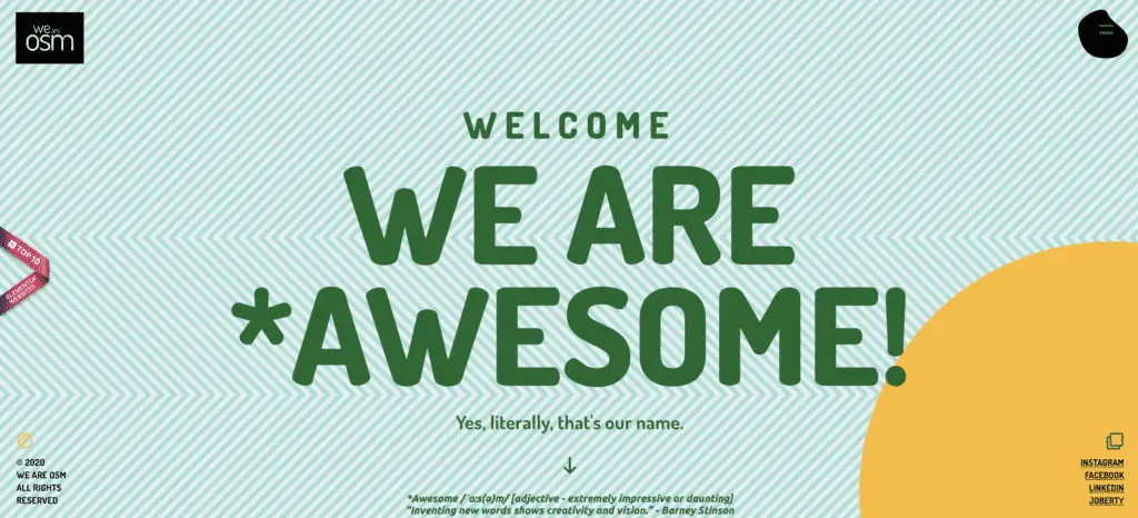
Well, just don’t go big with too many elements on your website – you don’t want your website to seem overwhelming.
Trend #4 Whitespace
Whitespace (negative space, the blank area between the design elements) can give any page, on any screen a well-adjusted look. Of course, the whitespace doesn’t necessarily have to be white, yet in 2021 many designers have embraced this trend. And it is going to stick around.
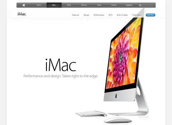
This trend isn’t that new among designers. The whitespace has always been a design principle, yet today it is larger, noticeable more than ever.
This trend is a great addition to the previously mentioned oversized elements – the combination of these two gives a pristine, fresh, and clean page look.
Trend #5 Exposed Grid
What if we told you that it is trendy to have a UX inspired by operating systems and apps? We beat that you won’t imagine such an appealing design. However, if you take a look at websites that follow the exposed grids trends, you’ll see that their look is contemporary, yet with a humoristic approach.
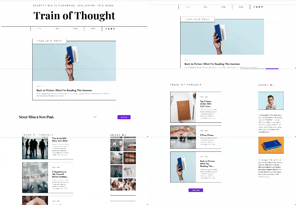
Rectangles and strokes, or thin lines, divide up our screen into sections, guiding our eyes in the desired reading direction. – explained at Wix.
Let’s just add that this trend is great for online skim reading
#6 (More) Minimalist Navigation
Wearable devices are getting more popular each year and that means that web designers need to think smaller. Therefore, the navigation has been simpler over the past years.
Today, we see the rise of ultra-minimalist menus, easy to navigate on basically every device.
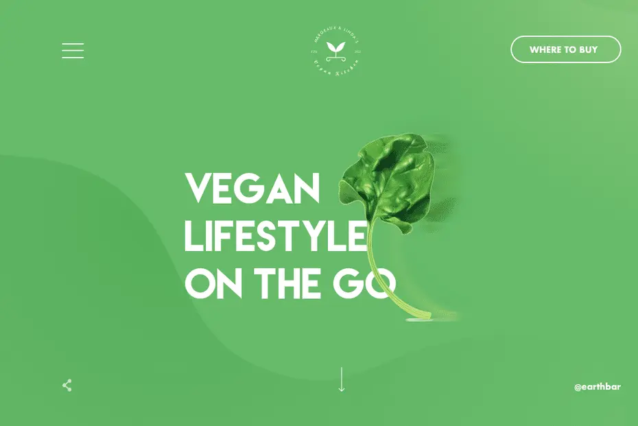
In addition, this trend gives websites a very sophisticated look and encourages users to use their imagination. One more trend that goes hand in hand with large-scale elements and minimum text!
#7 A Mixture of Photography and Graphics
A challenge that designers are facing today is how to communicate customized messages with users. The trend of mixing photography and graphics can be a great solution! Photos of real people or products can support the overall branding in a way that will distinguish you from the crowd.
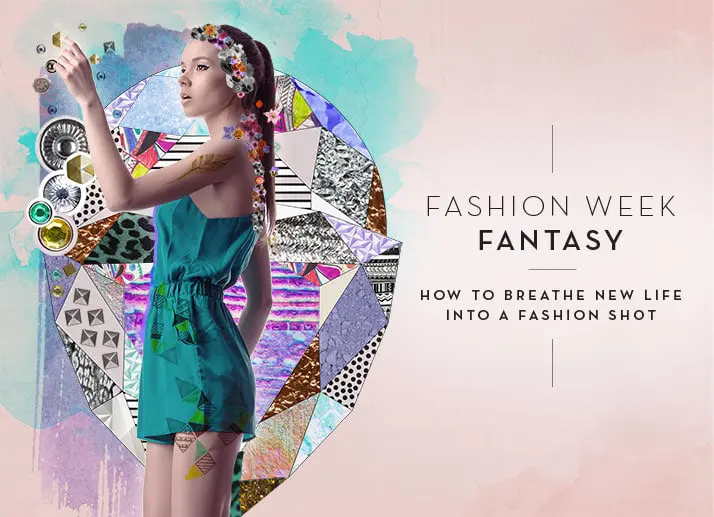
Create stunning visuals by overlapping graphics on top of real photos. Or, communicate abstract concepts in a simpler way – just imagine how easy can you explain your finance or tech business by the combo of visuals and photos.
Do you need help with website design?
#8 Tailor-made Illustrations
Spice up your story with visuals that fully support your brand’s identity. Surely, you can use some pre-made elements and combine them to craft a unique visual. Or even better – add some emotions and humanity to your web design with hand-drawn elements. Yes, they will be imperfect, but that’s the catch!
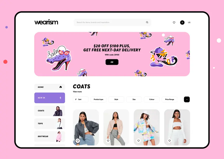
Users will appreciate if the see some realness in your design, they will recognize the designer’s heart and soul.
#9 Luminous Color Schemes
In the past years, we’ve seen glowing elements on websites that promote cryptocurrencies or ICOs. However, the trend of these futuristic color schemes is going to be around in 2022 as well.
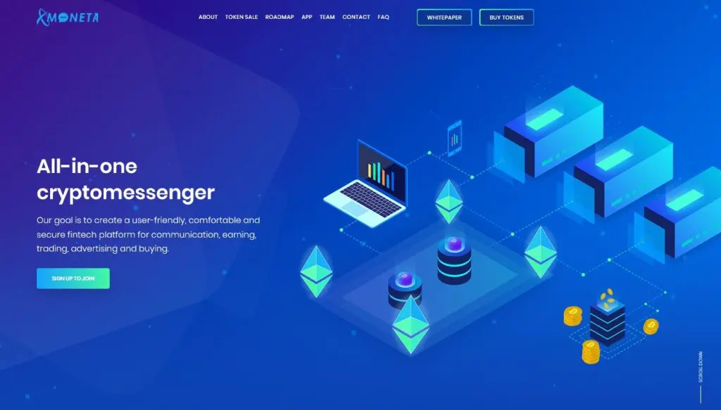
Futuristic color schemes and designs will be on trend next year, continuing with the isometric trend and bringing in colors like blues and purples and hot pink to give designs that futuristic glowing feel. – Adrianne Mesnard, Art Director at 99designs
We are excited to see how will this trend develop especially with the combination of dark mode and minimalistic design. Just imagine those glowing purple shades on a dark background!
#10 Bold fonts
Okay, so we know that bold fonts aren’t something new. But, in 2021 this trend has made a statement. Everybody is competing in grabbing the user’s attention faster, better. Bolded titles can be a great solution.
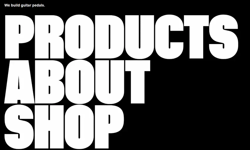
Apart from this practical aspect, the trend of big, bold fonts will add a modern feel to any site. Apple is a great example…and we are sure that they know what they’re doing, right?
#11 Split-Screen Content
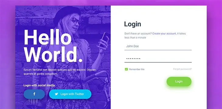
The captivating trend of breaking the rectangular mold in two (or more) is a great way to convey more ideas. Unleash your creativity, play around with different scroll effects and make each block move at a different pace.
#12 Overlapping Layers
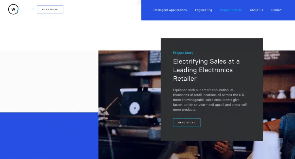
This trend is a good complement to the previously mentioned split-screen content. This time, try layering up elements to add a 2D effect. Visuals piled on top of each other can be a bit confusing, so don’t forget to use whitespace around the elements to make your composition clear.
#13 Fullscreen forms
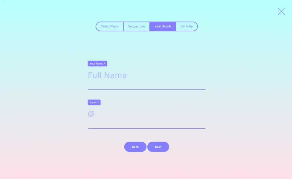
Online forms are a crucial part of many online businesses: from eCommerce, signing up to a service, webinar, etc. With the trend of big elements comes the popularity of forms displayed on a fullscreen.
In addition, expanding your forms looks more inviting and can result in improving your user experience.
#14 Retro – Futurism Style Fonts
Many old things are becoming very trendy again, same goes with throwback typography. However, we are not seeing the exact same fonts as before, rather a bit stylized version with a futuristic look and feel.
Designers have been experimenting, added a fresh touch to traditional fonts. The result is a new trend that would surely be around in the upcoming months.
#15 Horizontal Scrolling
At one point horizontal scrolling was a big no-no, however in 2022 it is having a comeback! More and more established designers are continuing to experiment with horizontal scroll and making this forgotten feature a rising trend.
However, if you want to implement this type of scroll to your website, be careful – it is not always completely UX friendly. Try to find the best way to make this trend work for you. It can be a very practical way to show secondary information, but let your users be able to find all crucial info through buttons, arrows…
We certainly encourage you to try out this trend since it can make a strong impact on your user experience, but try to avoid horizontal scroll for text that is important to read.
#16 Augmented Reality
The trend of multimedia experiences goes without mentioning, but we beat that you haven’t seen that many augmented reality (AR) experiences on commercial websites. Well, the cost of implementing such an experience to your website is still pretty high, but software made by Wayfair Technologies has made it more affordable.
Take a look at Jeep’s Build & Price a Jeep page (not just our recording, enjoy the whole experience!). Jeep leveraged a very useful solution during the pandemic times since it doesn’t require stepping foot into car dealerships. The AR trend will surely be seen on more e-commerce and retail websites and we just can’t wait to see all the creative designs they will promote!
#17 Custom Cursors
Why do designers overlook cursors when they can make such a big change to the browsing experience? Well, it seems that this won’t be the case in 2022, since cursor design is getting attention!
Just have a look how Büro’s morphing circular cursor changes its design depending on the element it’s hovering over! Simple, yet amazing, right?
#18 Monochrome With a Pop of Color
For monochrome look lovers here’s a design trend that will spice up your grey scale. Add a pop of color to an element or a hover effect – this simple touch will immediately make the desired element stand out.
Even a minimal plain design can cause a super-engaging experience with some colorful details. How do you like our e-commerce project where we utilized this trend?
#19 Scrollytelling
Copywriters and content marketers have been telling stories through web experiences, for quite a while. This trend is known as storytelling, but in 2022 it will be brought on a whole new level! Please welcome scrollytelling – visual storytelling that makes the whole experience even stronger, that hooks the reader into its narrative.
How?
This is where the creativity comes in. Try to add playback controls so the user can interact intuitively. Just make sure that the scrollytelling elements don’t distract the visitor from some important text.
Webflow’s Web Design Art History is a great example of scrollytelling done right, so make sure you check it out.
#20 Physical Products Turn Digital
There’s no need to mention that products are the heart of the websites, especially e-commerce ones. In 2022, we’ll experience a highlight on creative, digital interpretations of physical media.
This might come in the form of color smeared across a page like nail polish or images that are cropped in rounded rectangles like smart phones. Not only does this approach create visual synergy between the product and its website, it makes web pages feel more organic and unexpected. – explain at 99designs.
Bonus – Expert Insights:
As promissed at the beginning of the article, we’ve gathered a team of web design experts to share their knowledge and help us to update you on the trends for the following year.
The first half of 2022 has not been surprisingly innovative and different compared to the previous year and IT companies followed web design predictions provided a year back or even more. All new trends that are yet to set up the market on fire are expected to come in late 2021 – early 2022. Two of these trends should arrive first, most likely by the end of 2021.
Dan Irascu from Mobiteam, a Berlin-based design, development, and creative agency:
21. “50 Shades” of Dark Mode
The dark mode is related more to software design, and software development rather than web design. We’ve seen it in apps, OS, and a while back it appeared on the web. Now, the regular dark mode some websites display may seem either too dark or too bright for visitors. That’s why it’s time to give users some choices, simple but essential – 3 or more dark mode shades would improve the user experience. Other than this, the accent colors a website use should be compatible with the dark mode as a whole.
22. Animated Elements
Animations are taking the lead in the visual content market, and web design is next. However, the fundamental difference between animated elements and other web design trends is that they play a passive role. In web design key-icons, and UX heat zones (popular areas on heatmaps) are animated to surprise and encourage the next action. It’s a trick that has already been implemented by some websites, and will definitely become mainstream by 2022.
Jamie from Dazze, a studio with over 17 years of experience in eCommerce and brand identity:
23. Dynamic Content
Displaying different content based on the users location, behaviour, or previous purchase(s). Websites that have dynamic content have a higher engagement and conversion rate so I see this trend continuing.
24. White Space
More and more use of negative space, minimalistic design and simplicity.
25. Design with Data
As data has become the new fuel for businesses, web designing will go toward data-driven design in the future.
Nic Panayiotou, Head Of Design from Fortnight studio, a studio that has plenty od award-winning apps and websites in their portfolio.
26. Glass Morphism
One trend we see on the rise is Glass Morphism, which uses the idea of background blurs on top of multiple elements / layers to create a sense of hierarchy and depth for the user. It not only gives the impression of frosted glass, but helps to put emphasis on light and dark objects placed on coloured backgrounds.
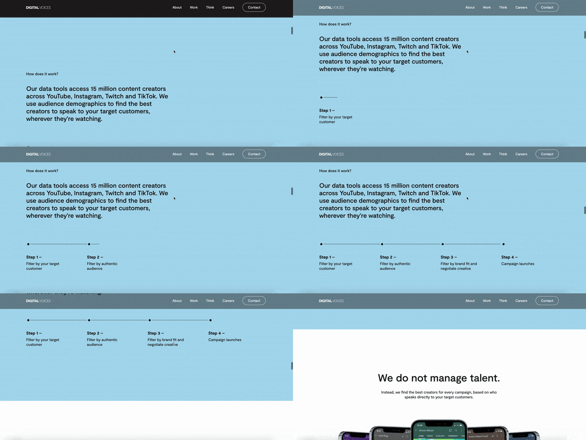
27. Horizontal Storytelling
With the increase of interactions available to create and use on websites, we’ve seen an increase in the ability to add horizontal interactive timelines. This not only adds a different dynamic to the site to keep the user engaged, but also reduces the length of the page.
Korman from Nocturnallab, a leading digital web design agency from Cardiff:
28. Pinstripes
Just like a fine tailored suit, very thin vertical lines add a touch of class and sophistication to a website. These work well on most color websites and add a subtle contrast with only two or three lines running through the page.
29. Less is More
Gone are the days where big splash images are required to grab the visitors’ attention. The use of shapes, color, and typography adds an element of surprise to the norm when landing on a website. Add a touch of animation, then they’re hooked.
30. Hyge Typography
Nothing speaks louder than words in your face. Choosing the right font is a must, but when done right, it captivates the audience and essentially spells the message out, sometimes almost acting as an illustration. This has gradually been making an impact over the years, but in 2022, it will become ever more prominent.
31. One-Page Websites
Some you may wonder who actually goes through the entire site… well the statistics back that fact up. Google has provided data that suggest over 70% of people never click on another page. Well in that case, what makes more sense than a one-page website. When time is such a valuable resource for visitors, you may only have the homepage to capture them… one-page sites will certainly paint the whole picture.
32. Dark Theme (just to confirm that it is a huge trend!)
We at Nocturnal Lab pride ourselves on our dark website, and with over 90% of websites that use the standard white background, using a dark background naturally draws the attention even to the subconscious mind. Dark, elegant, and mysterious… it will definitely capture the imagination.
Katarina from, Popwebdesign, web design and development full-service agency:
33. A Human Touch
Accessibility, minimalism, and the human approach will shape the future of web design. Neuomorphism is yet to unleash its power, but the push for a textureless 3D feel was well-received among the users.
Micro-interactions add a human touch to the design, help communicate action status, provide feedback, and allow users to see the results of their actions.
Finally, draw attention and convey dynamics with asymmetrical design.
Do you need help with website design?
We are eager to see more trends that will 2022 bring us – stay tuned for updates! Be creative, don’t be afraid to experiment, yet if you need a hand with making your website OSM – just send us a quote, no strings attached
