In this post, you’ll find all the main differences between the most popular WordPress page builders: Elementor, Divi, and Beaver Builder. If you are a regular follower of our blog you are probably already familiar that we are “team Elementor”. However, this comparison is purely based on facts.
So, let’s start. Here’s what we’ll cover:
Pricing
Pricing shouldn’t be the deciding factor when you choose a builder. However, we know that for entrepreneurs and small business owners every dollar counts. That’s why we decided to start this comparison by presenting you with the pricing plans that Elementor, Divi, and Beaver Builder are currently offering.
| Pricing features | Elementor | Divi | Beaver Builder |
| Starting price | $49 per year | $89 per year | $99 per year |
| Unlimited sites | $199 per year | $89 per year | $99 per year |
| Lifetime updates | No | Yes | No |
When it comes to FREE versions, Elementor is the most generous one. Beaver Builder’s offer is a bit limited, yet it is enough to start crafting and see if you feel comfortable using it.
On the other hand, the Divi builder is premium-only. Well, we must say that the $89 yearly plan has much to offer – unlimited domain support, all company themes, plugins, etc.
User Interface
No matter which of these three builders you choose, don’t worry – you won’t be dealing with the backend. All edits you make will be previewed on the actual site in real-time. More good news – Elementor, Divi, and Beaver Builder offer true WYSIWYG experience and all are very user friendly.
Which one is the most appealing to you? Let’s get you familiar with all three interfaces.
1. Elementor
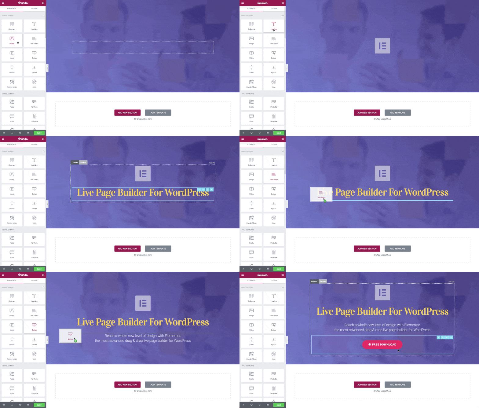
Since our website is built on Elementor, we’ll show you how does our Homepage look:
On the right panel, you’ll find modules that you can easily drag&drop and modify according to your needs. If you want to hide the panel simply click on the “Hide panel” toggle. The changes you make will appear on the left.
2. Divi
Divi gives you an option to choose between two builder versions: backend and frontend. It goes without saying that the new, frontend builder is more intuitive and you’ll probably be using it way more often.
After choosing the visual builder, you will see a blank page with a green “+” button. When clicking on it you can choose the layout for your row. Afterward, you need to choose a module and start crafting!
3. Beaver Builder
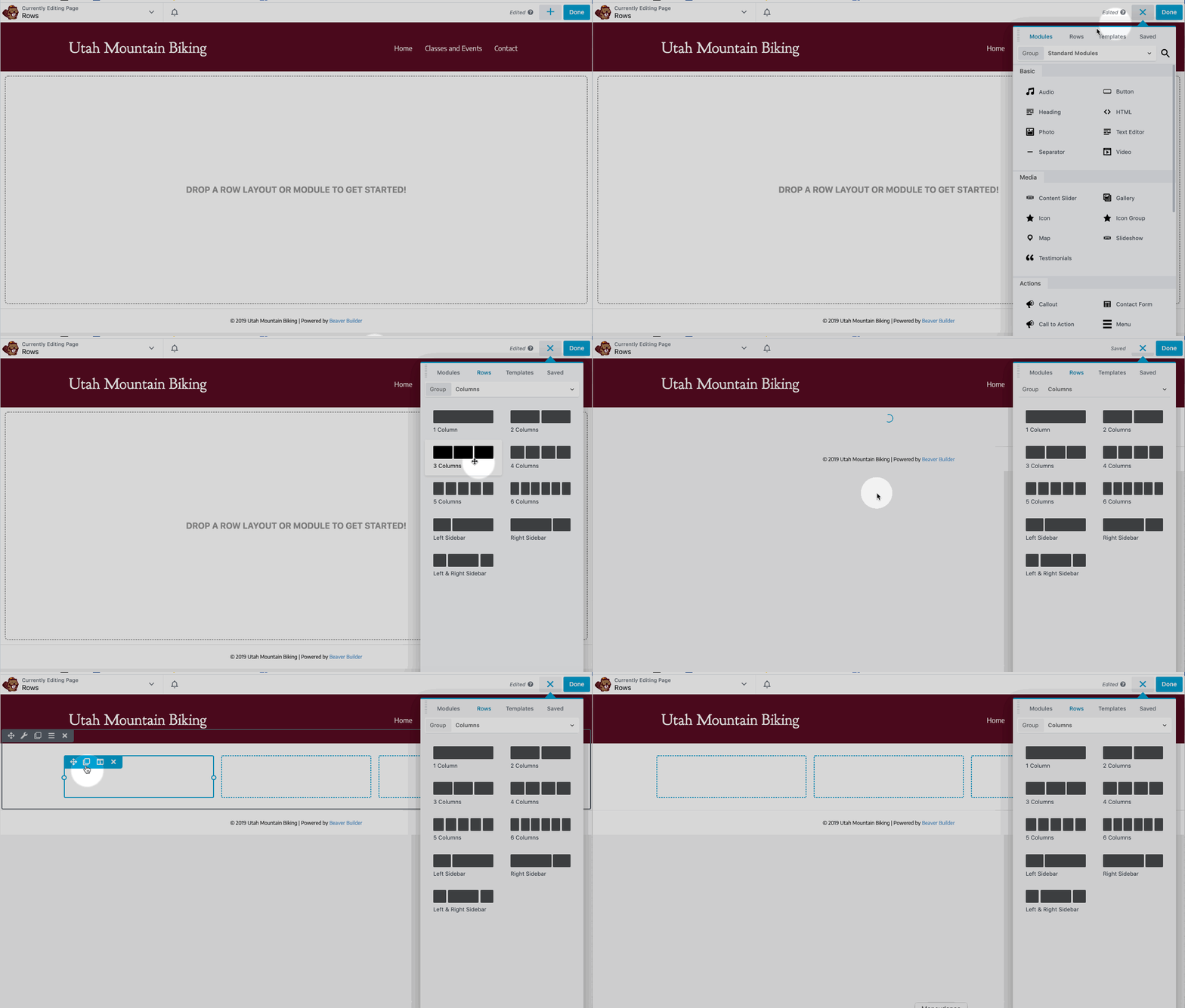
This builder has one option that Elementor and Divi don’t – you can drag and put the modules panel to the left or right side of the screen. Despite it might sound like a minor feature, this option lets you build your site in the way that is most comfortable for you.
To open the builder, just click on the “Beaver Builder” button in WordPress and it will take you to the visual editor. The modules will be on the left, but as mentioned – it is up to you where you will drag&drop the panel. Besides, there’s a “hide button” that lets you hide the modules panel.
Here’s how the interface looks:
If you ask our developers .- the winner here is Elementor since they find its interface the most appealing, intuitive, and with the best features.
Modules
Each of the builders we are comparing comes with various built-in modules and addons. The customization options are numerous. Here’s an overview.
1. Elementor
Elementor’s free plan comes with a limited number of modules, but if you don’t need anything that advanced, the free modules are more than enough.
The Elementor Pro version comes with extra features such as custom CSS for modules, more templates, header and footer builder, etc. Besides, there are many addons and plugins you can use to improve your crafting experience.
2. Divi
As mentioned at the beginning, the Divi builder is a premium only plugin. It has 40+ elements, various addons, premium themes, layouts and more. The most popular addons are Divi Booster, Divi Life, and Divi Cake.
3. Beaver Builder
The Beaver Builder has both a free and a paid version. However, the free version isn’t that “generous” like Elementor since it comes with 5 modules: Audio, HTML, Text editor, Photo, and Video.
As for the paid version, the Beaver Builder has a wide range of modules and addons to offer:
Whichever builder you choose you will have a lot of options when it comes to building your website. The only difference is that for some features you’ll need to have a premium plan. In addition, all of the three-page builders allow third-party developers to create modules, in case you need something extra.
Do you need help with website design?
Customization
When it comes to creating creative pages and websites – your imagination is your limitation. Each of these three builders offer plenty of customization options, especially when combined with different plugins.
Let us guide you through the customization options of the builders we are comparing .
1. Elementor
In Elementor it is very easy to customize any element by exploring three sidebar tabs. And it is pretty intuitive.
To customize anything related to the content, for example, the text, its size, alignment, or icon content, use the content tab.
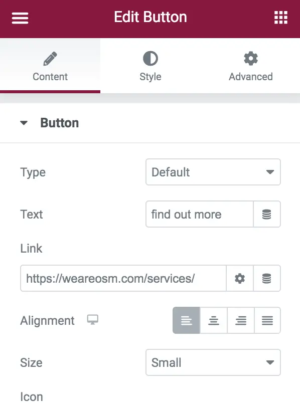
If you want to edit the style or color of the button, its border, hover color or padding, check what the style section has to offer. Here’s how it looks:
Finally, in the advanced section tab, you can customize or add CSS, responsiveness, animation, and more. Check it out:
When it comes to page sections, there are a lot of layouts where you can re-define the content structure, columns gap, content width, etc.
2. Divi
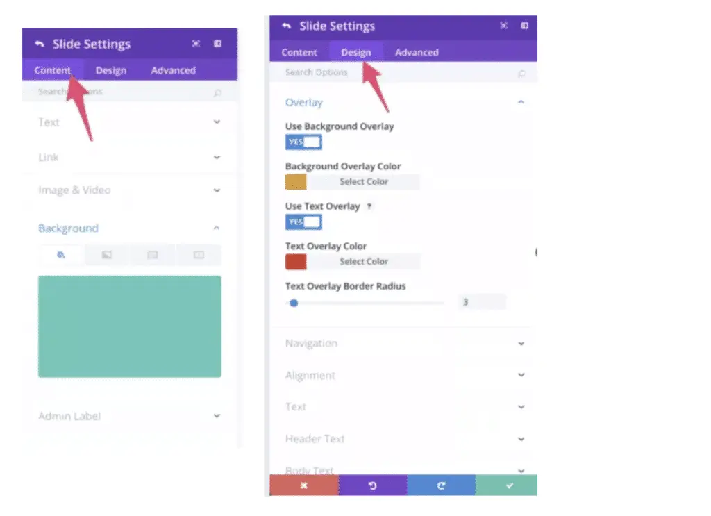
In Divi, after adding a desired module to the canvas you’ll find a gear icon with several customization options. Edit the content and design in just a few clicks.
When it comes to content, you can easily edit the background, link or text.
On the other hand, in the design section you’ll find options to edit the module color, overlay, adjust the alignment and more.
If you need more customization options, head to the Advanced section where you can add custom CSS.
3. Beaver Builder
The customization options in Beaver Builder are similar to the ones in Elementor. For each element on the page you’ll find three tabs:general, style, and advanced.
In the first, general tab, you can edit the text, add backlinks, icons and more.
If you want to change background, text or hover colors…
The advanced tab gives you options to change even more the module styles, to add animation, spacing, adjust responsiveness, etc.
The winner here is Elementor since it offers really a lot of customization options, but we must agree that Divi and Beaver Builder are not much behind.
Templates
All three builders we are comparing have a wide range of pre-made templates to offer. To be more precise:
Elementor – 100+ templates
Divi Builder – 180+ templates
Beaver Builder – 40+ templates
Of course, you can always craft a website from scratch, but with this many templates and customization options….why bother, right?
1. Elementor
Elementor has a great choice of pre-templates to choose from. In addition, you can find pre-designed block templates that can come in handy, especially if you have deadlines :).
One other very useful thing Elementor offers is the possibility to save any customized element as a (global) template that can be reused afterward.
2. Divi
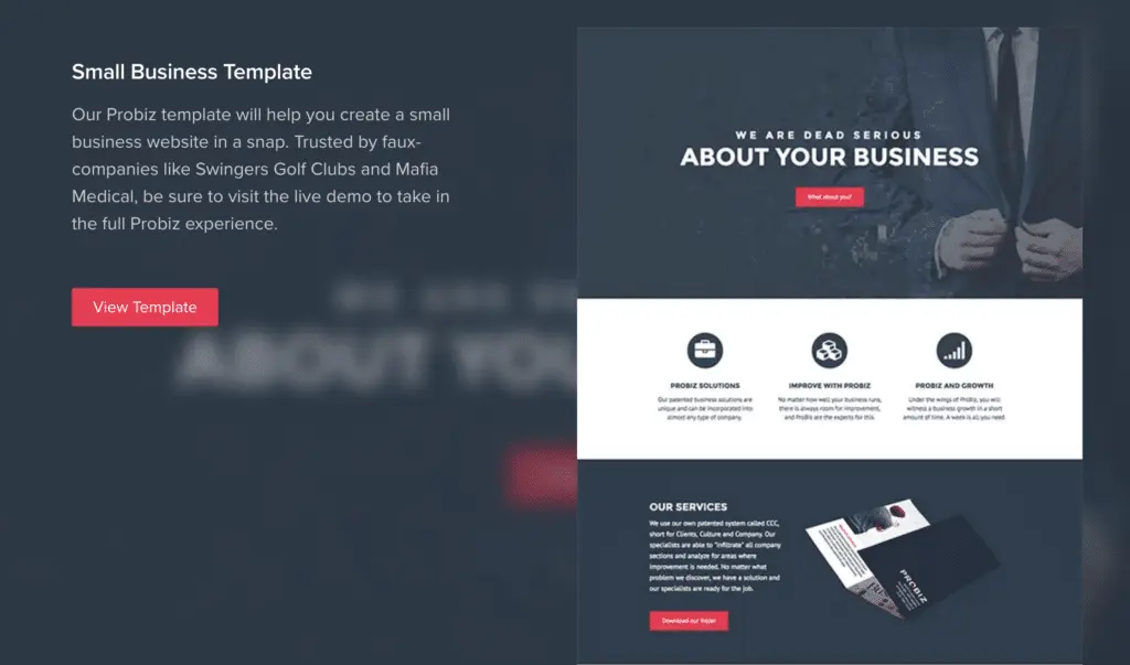
Divi has over 180 pre-made, nicely organized templates. Besides, you can save the landing pages you crafted as layouts. Take some time and check out the templates, you’ll surely find a suitable one for your needs:
3. Beaver Builder
Beaver Builder offers fewer templates than Elementor and Divi, but there are several options for every category. Moreover, the templates are arranged into landing pages and content pages so you can easily mix&match.
If you think that you won’t be able to find a design suitable for your business, you can always check some 3rd-party templates.
When it comes to templates, Divi had definitely the best choice here. If we need a “winner” in this category – the crown goes to this builder.
Unique features
The core functionalities offered by Elementor, Divi and Beaver Builder are pretty much similar. However, when it comes to some unique features, there are differences between them.
1. Elementor
Elementor gives you the possibility to create dividers in different shapes. For example, without any coding, you can use creative dividers such as drops, clouds, mountains, etc.
If you go for Elementor Pro, you can embed the Elementor designs anywhere on the website: sidebars, footers, headers…
2. Divi
If you decide to build your website with Divi, you’ll enjoy many neat features.
A/B testing is a feature worth mentioning. By using the backend builder you can A/B split test the module designs. That way, you can test modules and see which one performs better when it comes to conversions.
Another great Divi feature is the Role editor – restrict access to certain modules.
Moreover, there’s a feature that lets you to copy a style of a module, rather than duplicating the entire one.
3. Beaver Builder
When it comes to unique features, this builder doesn’t have much to offer. However, by default, all the licenses of Beaver Builder come with a white-label option. This is something that design agencies and developers will appreciate.
Final thoughts
And that rounds up our comparison of Elementor, Divi Builder, and Beaver Builder. Deciding which builder is right for you is a tough job. Luckily, you can’t go wrong with any of the three mentioned builders.
If you would like a team of experienced designers and developers to give you a hand with your website, don’t hesitate to send us a non-obligatory, FREE quote. We are here for you.
Do you prefer one builder over the others? Do you have other page builder suggestions we should add to this comparison? Let us know!
