
“A user interface (UI) is the space where interactions between humans and machines occur.” – with that being said, there’s no need for additional explanations why you should tidy up your UI. Besides, that’s why you start reading this article in the first place, agree?
Websites, landing pages, funnels, apps…they all get better with some UI tweaks supported by design experiments. The more the better.
Improve Your UI with winning (…and losing) A/B tests done by others. This certainly doesn’t mean that you shouldn’t experiment with your own UI elements. After all, continuous testing is done by the leading tech companies and that’s how they come to such great solutions.
In this article we’ve gathered some crucial tips on how to improve the main UI elements, all based on experience and years of different testing. Oh, but everyone likes to see some real-life examples! That’s why we’ll also share some UI solutions leveraged by Netflix, Airbnb, Etsy and other big names. Again, all based on their A/B testing (screenshots included!).
Okay, enough talk – let’s get to work.
Here are some practical, actionable UI tips:
Homepage and Landing Page
According to Wikipedia, a homepage is the initial or main web page of a website or a browser. That says enough about its significance.
As for the landing page, it is defined as a web page that appears in response to clicking on a search engine optimized search result, marketing promotion, marketing email, or an online advertisement. So, if you spend time and money to make someone visit a certain page, you want it to look right.
The homepage and landing pages have a few things in common:
- They need to attract and engage visitors;
- They need to make a visitor spend as much time as possible on your site/landing page and or go deep deeper on the other pages or perform a certain action;
- They need to initiate a visitor to do business with you (whatever it means for your particular website).
General tips (from best practices):
- Don’t confuse your visitors, show your identity clearly.
Your visitor needs to know immediately that he came to the right place. By using headlines (H1, H2…) and your brand visual assets you need to show what you have to offer to your visitors. Don’t get too creative and mislead your visitors – a confused visitor will probably just leave.
Here’s how Pitch combined simple copy on oversized headline with a motion visual element:


- Don’t try to hook all visitors to perform action, focus on your target users.
You don’t need website visitors. You need customers. Therefore, don’t be scared to narrow down your homepage to make it a better fit for your customer/user. Don’t go for easy wins, choose your emotional color, language and other details carefully.
Although this is an very old example, we still think the UI designer behind this solution nailed it.

- Help your visitors to perform action, make links and CTAs visible.
You want your users to click on a certain button or link – so, help them. Make the buttons easy-to-find, preferably above the fold. Same goes for the links. Whatever you want your user to do, make sure there’s an adequate button for that matter: “Download”, “Buy”, “Free Trial”, “Contact Us”, “Subscribe”…
IdeaBuddy is a SaaS that has yellow, highlighted CTA buttons on the homepage that immediately grab user’s attention. “Try It Free” is included in the header on purpose, so if a visitor has any doubts whether to sign up as a paid user, there’s always a reminder to test the tool first.

- Adjust the color scheme to your main audience.
As being the main visual part of your page, a color can leave a strong impression on your visitors. It’s up to you to try to recall the right emotion. To put it simple – a women’s fashion website is usually all about shades of pink, but corporate companies go for some grey-blue scale. This isn’t something new, but still – an adequate color scheme plays an important role in UI. A little reminder doesn’t do any harm, right?
Read more how we’ve created our color scheme when working on our company rebranding.

- Say “Goodbye” to sidebars and sliders.
As said above, you don’t want to confuse your visitors. That’s one of the main reasons why modern web themes and templates don’t have any sidebars and sliders on their homepages/landing pages. Why? – just because there is way too much information that tends to clutter the page and distract the users from the main content. Instead, opt for links, as advised before.
ThemesKingdom has a lot to offer. However, the above-the-fold homepage section gives their visitors the possibility to check thousands of pages (themes) they offer by clicking on the CTA button.

- Display social proof and user feedback
Social proof is the idea that consumers will adapt their behaviour according to what other people are doing, explain at Hubspot. And we bet that you would opt for a service or product that has already been praised by other customers. We would.
Statistics show that a (good) social proof can make a difference in making users click on a CTA button, so why don’t put some effort and show off with some good reviews.
There’s a bunch of ways how to display social proof, here’s just one idea:

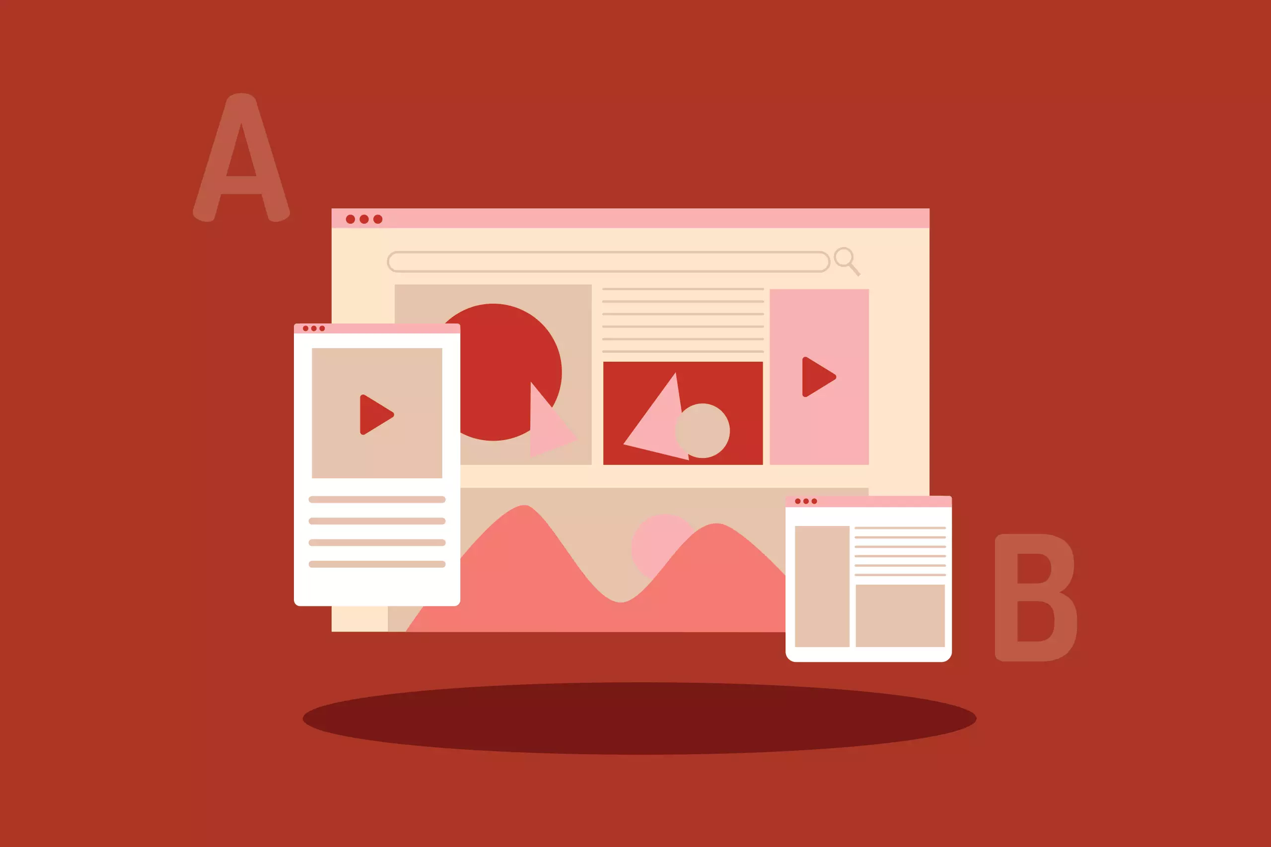
Okay, let’s have a look at how some (very) big players managed to nail down their homepages by A/B testing their crucial elements.
Airbnb photo size A/B test:
A while ago, Airbnb tested the size of the header photos on the Host signup page. They wanted to see if the increased photo size would perform better…but it didn’t, so the idea was rejected in less than a month.
A – version, a screenshot from Aug 1, 2019 (implemented Sep 13, 2019)

B – version, a screenshot from Aug 1, 2019

Not only can we see changes In the B variation in terms of an increased image height of the image, but the navigation is also more transparent, without the duplicate “Get Started” button on the right (top).
Today, this landing page looks much different, but that doesn’t mean that we can’t learn from their previous testing. After all, this version was live for quite some time.
Netflix big CTA button size A/B test:
The CTA button is probably the most crucial part of any landing page. When it comes to the button size, it isn’t that easy to find the perfect dimensions. Netflix has been testing several versions and it seems that they’ve founded an optimum size.

As mentioned, the key variable in these experiments was the CTA button size. However, the B and C versions were rejected after two months of testing.
Although the purpose of this A/B test example was to showcase a good CTA size, we must mention that the 30-day free offer is the best option…for all professional Netflix watchers. Like us. Oh yeah, the UI is fine too 🙂 .

Booking search form A/B test:
Booking.com has a great UI. No wonder, it is known that they run A/B tests. This time we’ll focus on one they’ve done for their Apartments landing page. Since the search form is one of the crucial parts of the page’s UI, the team from Booking.com has tested several minor tweaks such as:
- Headline size
- Single and Multiline search bar
- Form fields sizes
- Button copy
- Social proof
- False bottom

The search bar remained the same till today, with just some minor changes.
Product Page
No matter if you have an e-commerce website or a SaaS, a product page is the place where a user usually makes the make it or break it decision. Well, why do we see a bunch of bad product pages, especially when it comes to e-commerce? – don’t let your page be one of these examples. Show off your product proudly, here’s how.
General tips (from best practices):
- Keep it minimalistic
Cut the clutter and embrace minimalism. Of course, reviews and other social proof are very helpful, yet make sure that the focus is on the product and the call to action. Keep the browsing experience simple and easy, don’t go for too colorful backgrounds.
One of our clients, Reka has a very artsy website, that complements the whole Reka story, yet the shopping experience itself is very simple.

- Have a clear CTA
As mentioned before, you don’t want to confuse your viewers. Especially not at the stage where they need to make a decision whether to “Add to Cart/Bag”, “Proceed to Checkout” or “Buy now”. That’s why you should make these buttons very clear, visible, and use color contrasts. It goes without saying that you should avoid links. A button is a button.
For example, Amazon’s yellowish buttons are pretty engaging:

- Product photos must be high-quality. Perfect.
Give the user a strong grasp of what he is buying. High-quality photos is something worth investing in. Let your users zoom the photos and see the product from different angles. American Muscle provides their customers with the possibility to upload their own images which often turn out even better than the corporate shots.

- Keep the copy concise
Product description is something many shop/product owners don’t write good, good enough. No matter how good your product is or how professional your photos are, you can’t go very far without product page copy. So, why don’t make it worth the effort?
Elements you need to include are: price and other fees, shipping terms and information, product sizes and colors. Or, when it comes to software then there are details about each pricing plan, in detail.
Keep copy concise and highlight the high points. Use bullets to help visitors read and digest them quickly. – advises Neil Patel.
Ikea is a great example to follow:

Let’s move on to check once again the results of some A/B testing.
Etsy shipping timeline A/B test
Etsy has played around with the shipping timeline and we can see that shows a bit more details performed better. Customers feel taken care of when you give them at least a bit info on the time of their order dispatch and approximate delivery time.

Bol’s customer rating and CTA button A/B tests
As mentioned above, customer ratings are an UI element that can make a difference when it comes to the purchase making decision. The e-commerce giant, Bol, has been testing several variations of presenting customer reviews in the best possible way and here’re the test results:

As for the CTA button, we’ve already mentioned how important it is so testing with it’s size, color and position is always welcome. Last year Bol tested eight different CTA variations and here is the winner:


Just so you can understand the test better, here are the English translations of the button copy:
B: Order
C: In shopping cart
D: Add
E: Buy now
F: Order now
G: In my shopping cart
H: Yes, I want this (one)
Pricing Page
When a potential customer lands on the pricing page you really want to make sure that he finishes the purchase. An intuitive pricing page can help you to increase the conversion rate and get those desired sales results.
How to design a pricing page that has all needed UI elements? The tips and A/B test results are below, just keep reading.
General tips (from best practices):
- Use psychology-backed techniques.
A potential customer that spends some time on a pricing page has many thoughts running through his head and all of them lead to making the final decision: to click on the CTA button or not ( no matter if it is the Free trial button, Buy now or other). There are some techniques, based on psychology research that can be useful for this matter.
For example, price anchoring is useful to show how your prices compare with similar options (of course, make sure that your plan/price is more affordable).
Then there is the hack with a limited amount of available products, a short-time special offer or similar tactics that emphasize the urgency to buy before it’s too late.
Factcool is using limited time sales for some time now…and I must say that they’ve got me as well!

- Use copy and colors to show value.
Use contrasting colors and sizes to highlight your best offer, especially if you have several pricing plans or bundles. Of course, you’ll adjust all the elements in accordance to the site’s overall layout and look, but here’s how AdEspesso nailed it (this isn’t their newest pricing page, but is still a great example):

- Show your most expensive offer first, but highlight the best-value option. Or not?
Which offer to list first: the most expensive or the most affordable one? Surprisingly, various research shows different results. This is where A/B testing will help you to find a solution that is most appropriate for your customers. However, here are some insights to help you get started:

How do big companies manage to have such great pricing pages? Well, again – by conducting A/B tests. Here’s an interesting example.
Netflix price comparison table A/B test
Netflix has been experimenting with the look of their pricing plan: the traditional pricing comparison table vs self-contained pricing plan tiles. Well, the good old simple table is the winner version.

Conclusion …and disappointment
If you read our whole article you’ve probably got the idea of how A/B testing can help you to make huge edits or little tweaks to your UI that will result in more visitors, clicks, conversions. Furthermore, you saw that well-established companies still rely on A/B testing and its learnings.
On the other hand, A/B testing has its own limitations:
- it works only for fully implemented design
- it can’t tell you what is wrong and why
Still, we recommend making this type of testing an essential part of the UI process.
If you need assistance with shaping your idea into a stunning visual story – OSM is here to help. Just send us a message, no strings attached and let’s see if we can use our knowledge and experience for creating a fantastic UI/UX tailored to your needs.
*Disclaimer: we need to mention that goodui.org and their A/B test results were a huge help for writing this article. For more great examples, check out their other leaks, tests and patterns.