
Here’s the shocking fact: the average website conversion rate across all industries is 2.35%.
But there’s always the other side of the story: the best websites have conversion rates of 11% or more. That’s almost five times the average, so there is light at the end of the tunnel. A bright light!
Do you have a landing page that isn’t converting like you want it to, or you want to create your very first landing page high-converting from day #1?
You’re in the right place!
First things First, What is a Landing Page?
A landing page is a web page with a very specific goal – conversions. It’s where your subscribers will land after clicking on a link on your website, a social media post, or a mention on your podcast. The usual landing page talks about a free offering and lets your audience sign up for it.
In other words, landing pages nurture leads into customers, which makes them an essential piece of your marketing strategy. If your landing page resonates specifically with the wants and needs of your audience, they will be far more likely to convert. No matter if you have a big e-comm business, you run a SaaS PPC agency, or you are a, let’s say a private chef, with a simple website, landing pages should be an essential part of your digital marketing strategy.
Now that we have reached this point, it’s important to distinguish between a home page and a landing page.
A home page shows off your brand. It welcomes the visitors to learn about you, lets them explore a range of your products, and offers additional info about your company and its values.
From your homepage, a visitor can go anywhere, but they won’t necessarily make a purchase or fill out a sign-up form. And that’s the point.
A landing page is there to convert users.
For that, there are five essential features your landing page should get right:
1. Craft Your Unique Value Proposition (UVP)
The unique value proposition is a statement that describes what differentiates your product and gives you an edge over your competition. It should sum up what you do and answer the “What’s in it for me?” that drove the visitors to your landing page in the first place.
“Price is what you pay, but value is what you get”, W Buffet.
Start from scratch. Who is your target audience? What is their pain point? How does your product or service address that pain point? What do your visitors need to see and read to be persuaded to choose you?

In this example, MailChimp leads with a very clear value proposition and makes promises.
Tell your audience what the incentive is and what it is going to deliver. Be consistent. People should immediately understand what your business can do for them.
Paint the picture of HOW your product or service will lead your visitors to their desired result.
It sounds like a lot, but brevity is key here, so cut to the chase; it’s vital not to overwhelm with the copy. If your unique value proposition is not very clear and powerful, your visitors will bounce off.
2. Create a Strong Call to Action
Your call to action is a clear and upfront invitation for the users to take the desired action. It should be attractive, concise, and create urgency.
Use very few words. The less, the better. Make a promise and tell your visitors what to expect. The ideal call to action should trigger that “Say no more, I’m in!” moment.

Here, Dbrand shines with clean, simple copy.
Speak as your audience speaks. Make it fun and casual if that’s the tone of voice your audience enjoys.
People are getting creative with the design of their calls to action. It’s important to keep your colors, images as simple as possible, in line with your company branding, not to confuse your audience.
Simplicity earns a premium: landing pages with more than one call to action get 266% fewer leads than pages with a single. Also, having fewer links on your landing page increases conversions. So don’t make it hard for your visitors to convert. No noise, no distractions.
Try to personalize your visitors’ experience. If they’re looking for consulting, consider adding a scheduler so that they can schedule a free call with you.

DigitalSilk, a custom web design company, uses a streamlined form and high-quality design & copy for a mesmerizing combo.
Place your form in the first half of the page, easy to find. A good web design and development company can help you condense it when scrolling down to make it flow easily above the fold.
It would be best to ask for your visitor’s name & email only; ideally, just the first name. The more info they have to put in, the more likely you’ll lure them for the worldwide web.
If you need more information, look at a 2-step process. You’ll get fewer sign-ups but good quality information. It’s important to give your visitors the option to provide more info or a detailed description of their needs if that’s valuable to them.
Lastly, you shouldn’t rely entirely on your CTA buttons and forms. If it’s easier for your audience to call you, add your phone number on your landing page. Making yourself easy to find yields far better conversions.
3. Focus on the Benefits, not the Features
On landing pages, it is best to keep your visitors focused by limiting a lot of stuff. A landing page usually has no menu bar and no sidebar. You want it to be a standalone page, and it has to instantly convey the feeling that your visitors are in the right place and there’s no need to browse further.
Define the problem you solve, how you solve it and the results that you render. Minimize the possibility of a distraction and loss of a subscriber. Do this check again and again from time to time to make sure that your landing page hasn’t strayed from your original goal or that it aligns with your new goals.
The more distractions and decisions someone has to make, the more likely you’ll lose them, especially if they’re new. Consider offering a discount or gift with a diminishing timeframe to encourage a quicker conversion. Call it FOMO it you will, the fear of missing out.

Shopify shows that having content is an asset. Their copy is on point: actionable, memorable.
Another important aspect, especially for small businesses, is to use local language in their landing pages. Plus, localize your landing page if you service non-English speakers. It’s genuine, and it’s a nice touch to keep people on the page.
Make your landing page accessible for people with health conditions or impairments if they’re part of your audience. Ensure the text contrast isn’t weak, and choose a legible font that is intuitive and makes it easier for them to read and navigate your page.
The whole point is to focus on people, not search engines. People want to support people, and your copy should resonate with your visitors’ problems for you to be able to deliver a top-notch solution.
4. Make your Hero Image a Superhero
The human brain processes visual data 60,000 times faster than text, so use your colors and imagery wisely. Branding that captivates us visually has a massive impact on what we consume.
Landing page images should convert naturally and effectively. Use real pictures of real people, of how real your business is. You should use your landing page as an opportunity to let people know they’re in the right place and build credibility.
Don’t use stock photos or templates. Stick to videos or images depicting your company’s work.
Being genuine boosts your trust factor, and trust is the foundation for your conversions.
Avoid pictures of your logo. Instead, show the passion that drives your business. Nobody wants to see brand identity portfolio documents and jargon on your landing page. Evoking emotion can lead to your visitors taking action.
For small businesses, casual photos fare better than professional photos. They incite trust. Especially if you’re on a tight budget, casual photos make sense. It’s not always about the quality of the picture; it’s the integrity of it. Do A/B testing and see what works best for your conversions.
- Remember, high-quality images can take a toll on your website performance, and even a two-second delay in your webpage load time can surge your bounce rate by 103%, which is huge.
- Your site should take no more than two seconds to load. If it’s more than that, it’s time to trim the fat down because your landing page needs to be fast.
- Not only does Google favor fast websites, but your visitors will be able to decipher your offer quicker.
- Also, 86% of the top landing pages are mobile-friendly, so being mobile-friendly is an absolute must.
A mobile-friendly landing page should be responsive and adapt to your phone’s screen. And again, it should load fast.
5. Social Proof Matters
Use your landing page as an opportunity to show people who use your product or service. Take pride in your work. Social proof increases the likelihood of your visitors taking action.
Prove you are established and use strong figures. “Trusted by over 1,000,000 people worldwide”, “In business since…” are great for reducing your visitors’ sign-up risk decision.
So, use testimonials to make your landing page more powerful. Position your best testimonial, preferably from an opinion leader well known by your target audience above the fold.
If you do not have a star testimonial, it might be best to place this section at the bottom of the page so that it doesn’t hinder your unique value proposition and call to action.
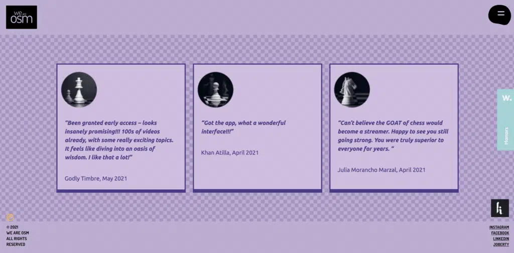
When creating our landing page dedicated to the Kasparovchess project, we’ve leveraged the power of testimonials with quotes from the platform’s users.
Your landing page can also have links to your social media profiles. Customers can learn more about your business from social media. They’ll feel comfortable with your business, and they’ll likely convert.
Takeaways
Optimizing these features can do wonders for your landing page conversions.
It’s vital to have one clear, enticing call to action. Be bold and creative. Make sure your copy is clear and actionable.
Remember, landing pages alone don’t do all the work. Your entire website experience has to be on point. A bad website with qualified leads won’t convert, so consider checking our custom web design services for the best results.