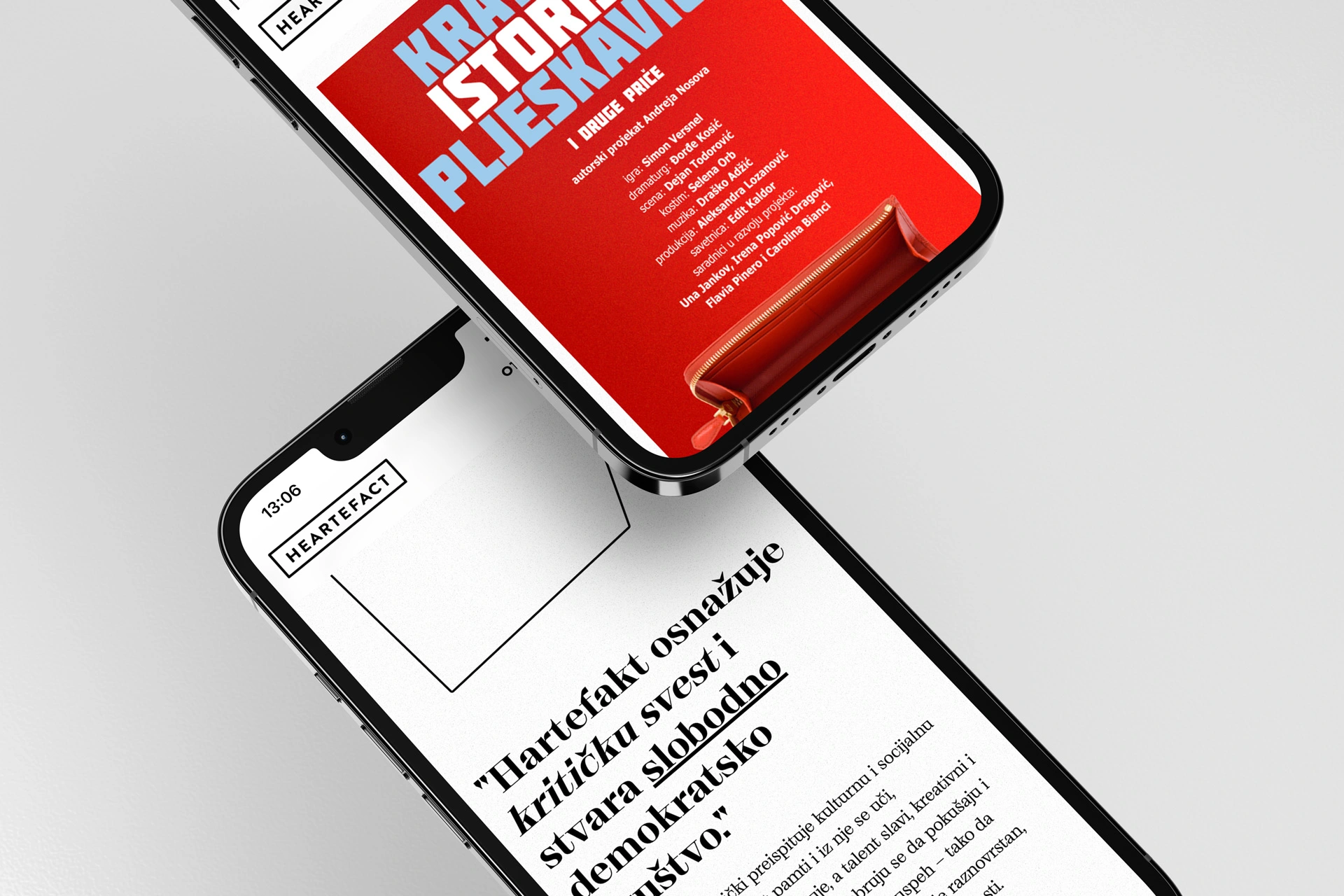
Heartefact is on a mission to strengthen critical awareness and build an open and free society. The platform unites actors who wish to live in democratically organized societies that espouse civic values.
The team behind Heartefact apart from having plenty of experience has a very specific, artsy approach to their own branding. For OSM, it was a challenge to wrap up all the projects that Heartefact has done so far, to present their story and expertise in the right way, and to align our design to their vision.


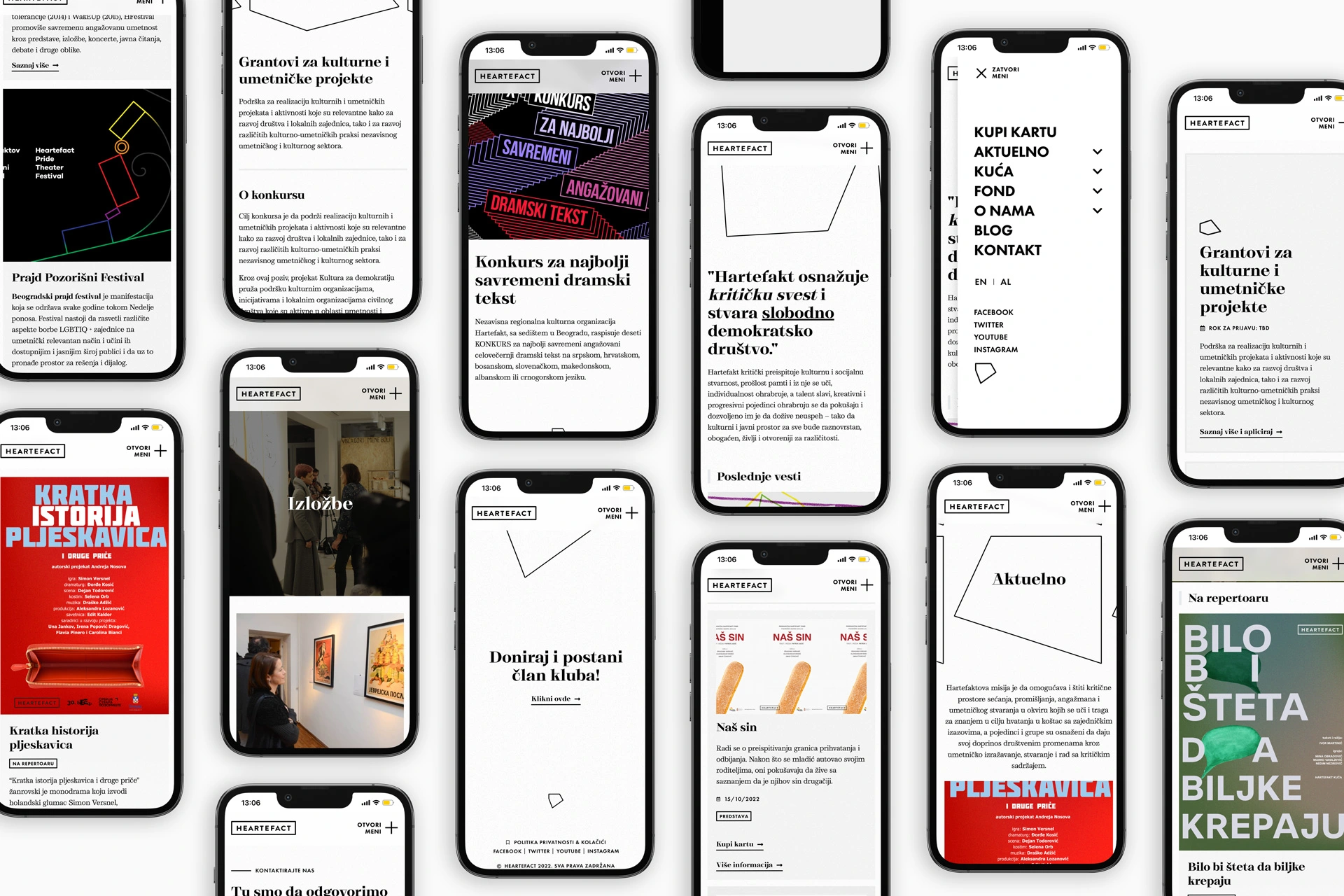
OSM’s goal for this project was to create a new website that will be super-optimized, easy to navigate and to browse through Heatefact’s diverse portfolio.
The website has a lot of content, arranged on different sections and pages, so the website’s user experience needed to be flawless. Literally.
That’s why we’ve added a lot of filters, mini sections, and dividers that would help the user navigate, but also enjoy the great stuff Heartefact website has to offer!
The design is pretty clean, but we did add some creative, artistic details. Did you notice that we used Heartefacts’s logo instead the jump-to-section arrow? Now, how OSM is that? :) Although white is the main color used for the website background, a splash of light gray matched perfectly with the images and other visual elements.